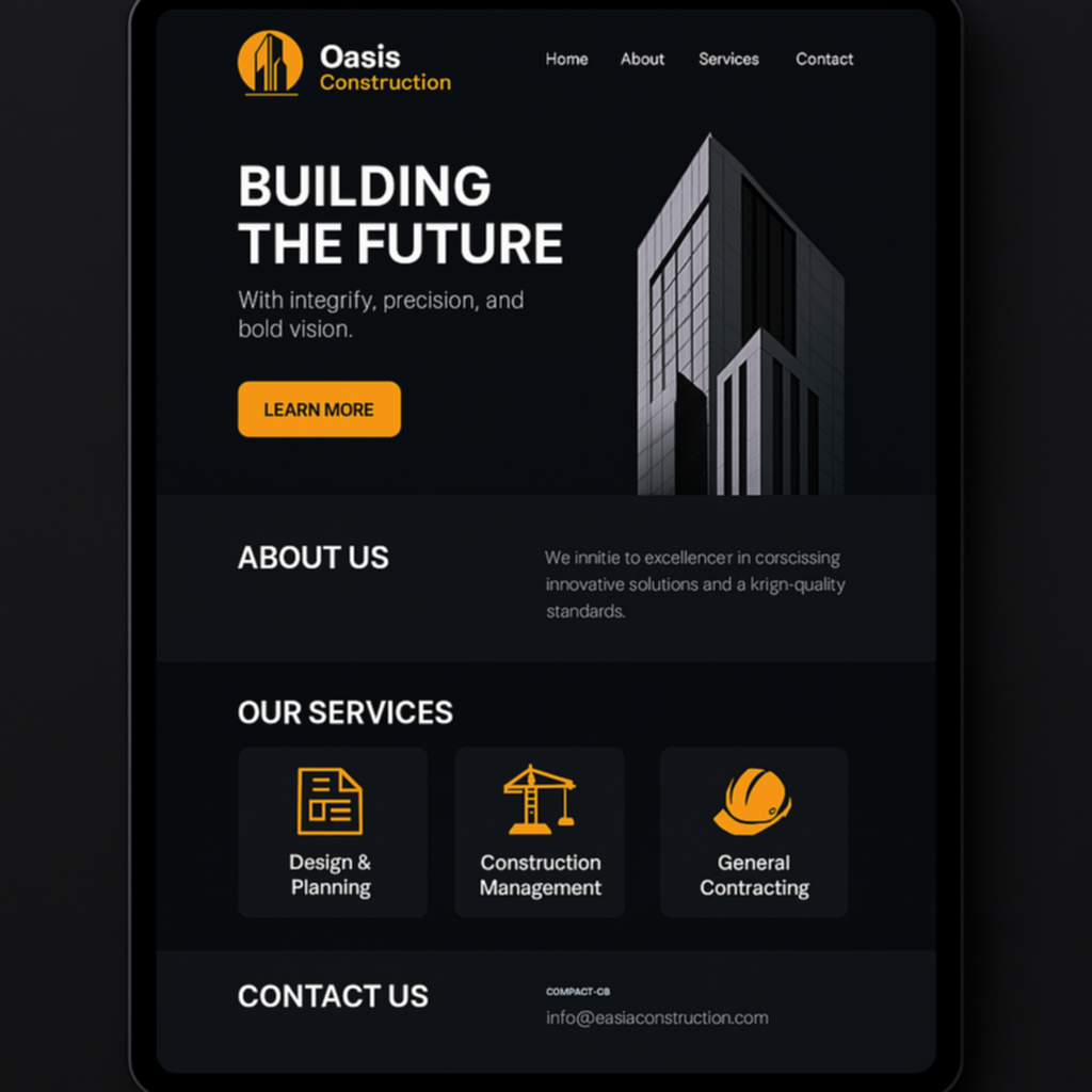
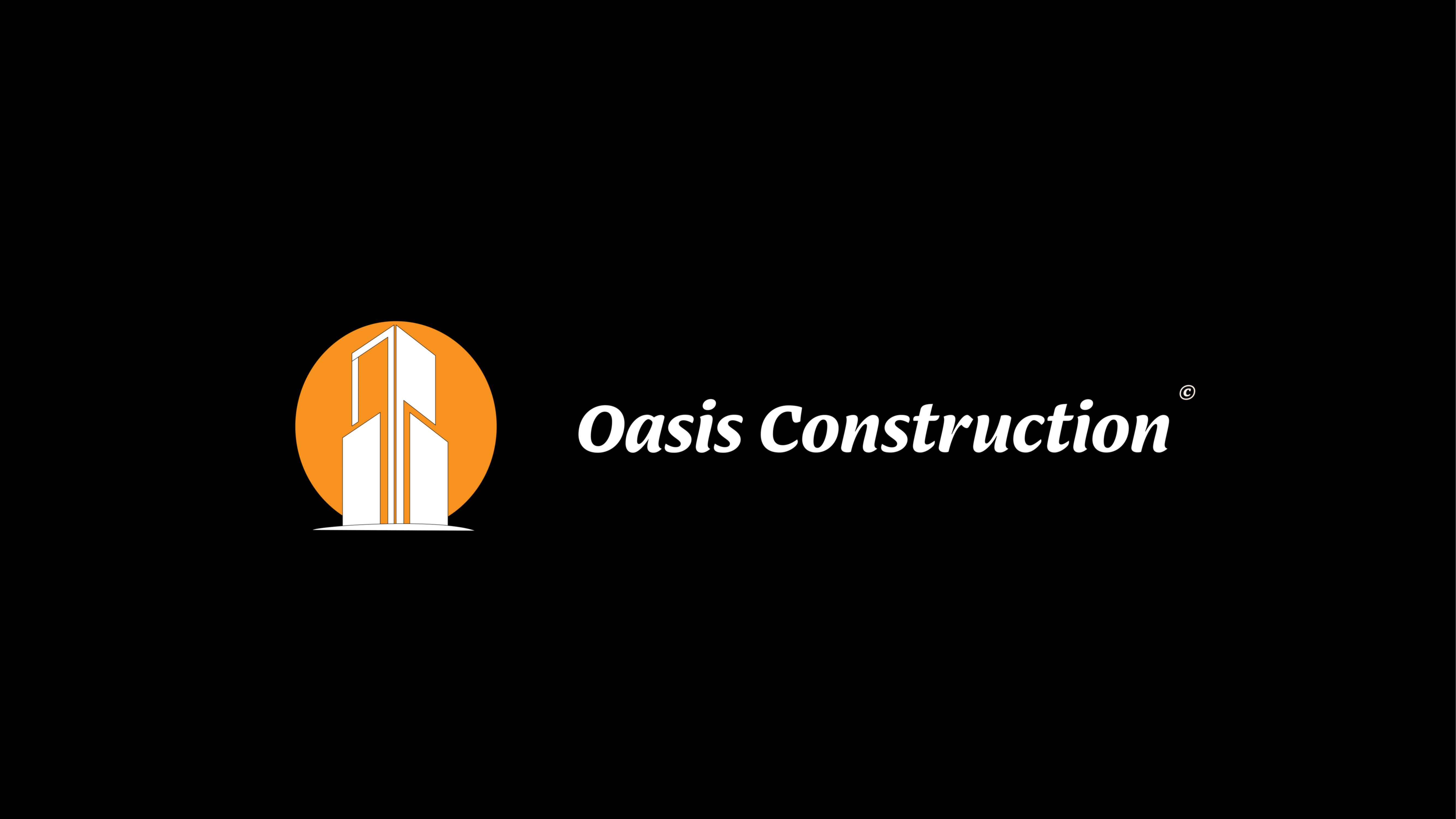
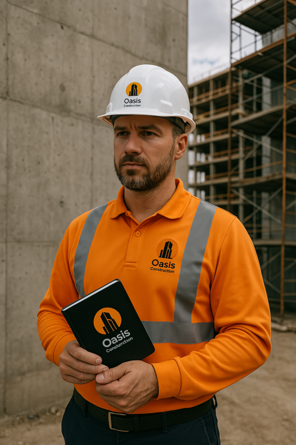
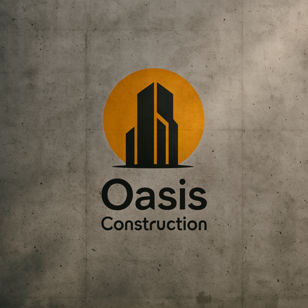
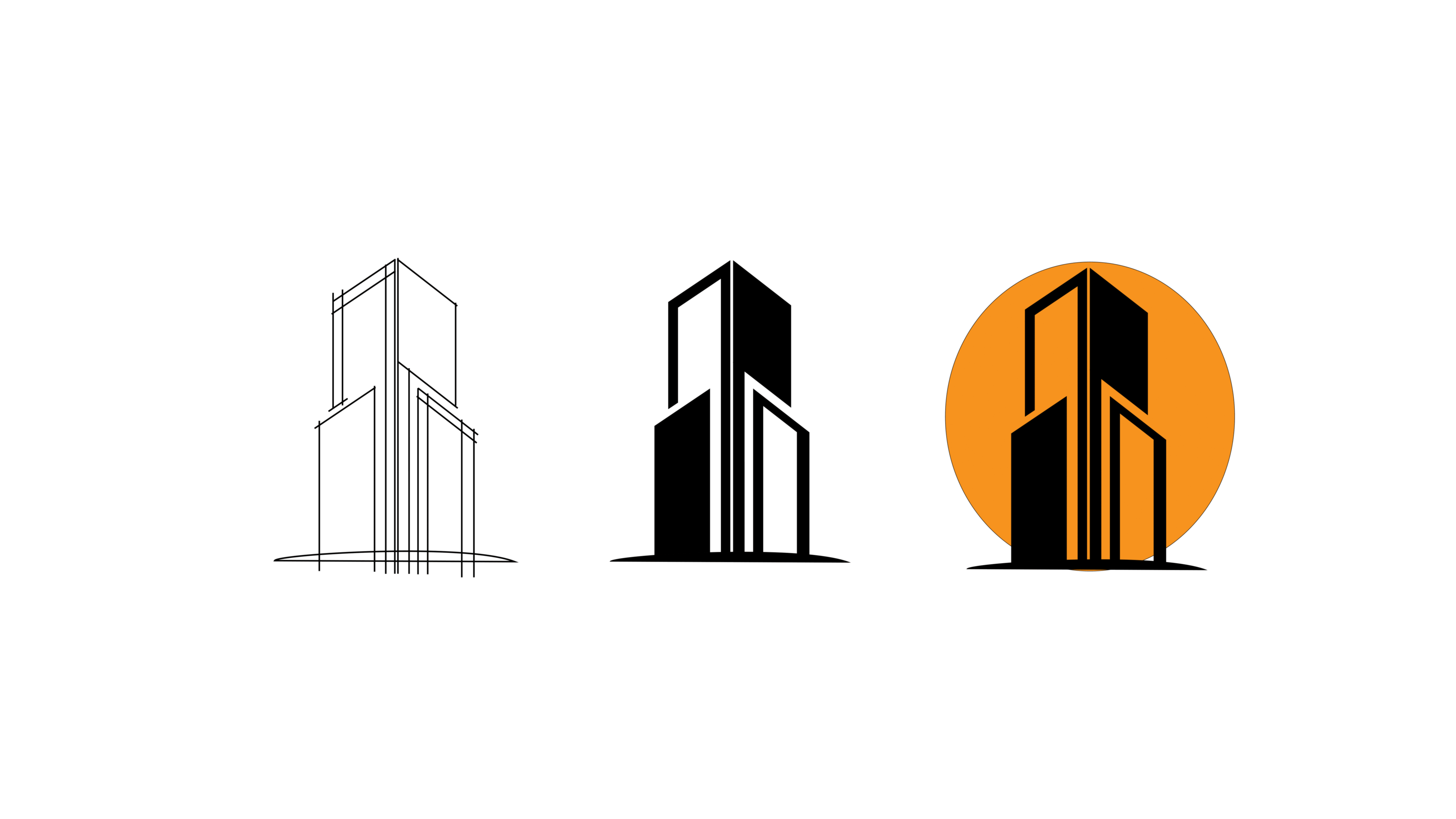
The logo for Oasis Construction was created to reflect the essence of a bold, modern, and ambitious construction company. The visual identity needed to inspire trust while standing out in a competitive market. The design blends architectural symbolism with strong, clean lines to suggest structure, growth, and innovation.
At the center of the logo is a stylized high-rise silhouette, subtly integrated into an orange circle representing energy, dynamism, and a constant rise—values deeply aligned with the construction industry. The choice of typography complements the symbol with a contrast between the soft, approachable feel of “Oasis” and the bold, impactful presence of “Construction.” This duality captures the balance between human-scale service and large-scale projects.
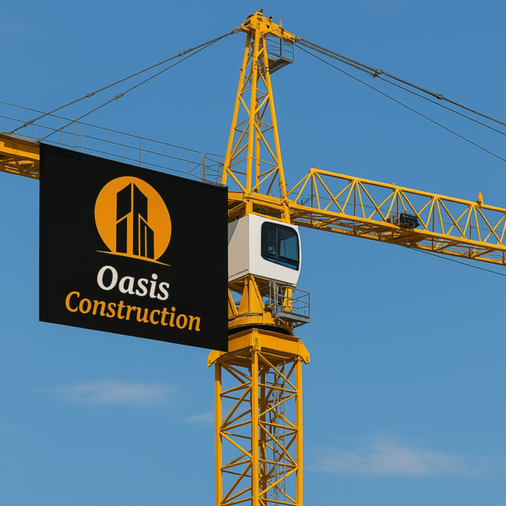
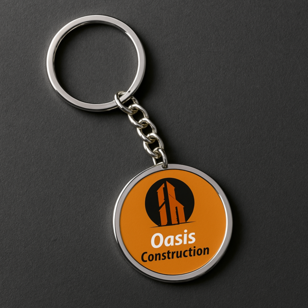
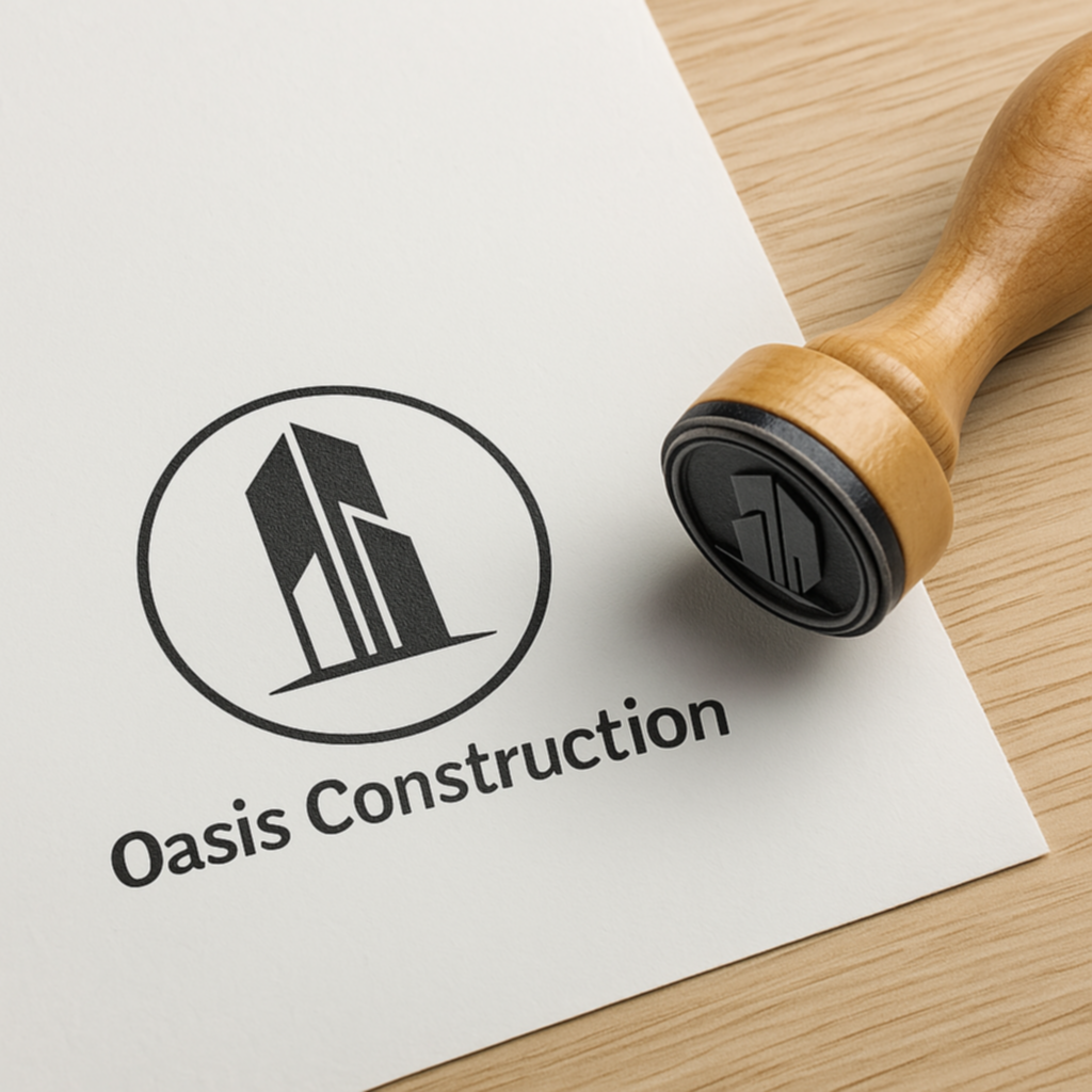
This logo is the cornerstone of the brand identity, adaptable across all visual supports—from signage and business cards to digital platforms and construction equipment. It was designed to ensure recognition, professionalism, and clarity at every scale and in every context, reinforcing the credibility of the company wherever it appears.


- Categories: Gallery
- Date: 02 October 2021
- Client: Oasis Construction
- Live Preview: www.virtuos.life